Week 7 - Communicating data science results effectively
Tips for effective data visualization, communication of results, and misrepresentation of findings 💬
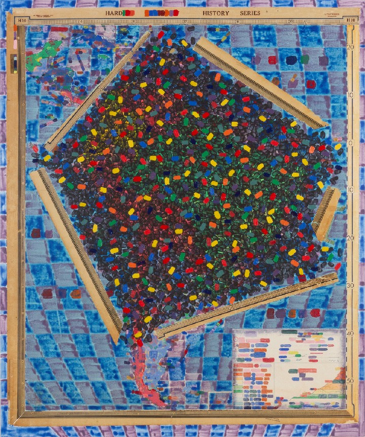 Dan Mills, Amazon Region with borders (with the estimated number of nations and tribes at European contact marked in black, and the estimated current number marked in colors), 2020, acrylic on collage laid down on board, 55 x 46 inches
Tasks
- Complete the readings
- Watch Alberto Cairo’s guest lecture and complete the How Charts Lie reflection.
- Complete the assignments
Slides
No. |
Title |
Slides |
|---|---|---|
| 01 | Tips for effective data visualization | |
| 02 | Creating Accessible Data Visualizations in R |
Guest Lectures
No. |
Title |
YouTube |
Length |
|---|---|---|---|
| 🎤 | Alberto Cairo - How charts lie | 57:23 |
Class Activities
Activity |
Title |
Date |
|---|---|---|
| Topic Intro | Tips for effective data visualization | Tue, 29 Oct |
| Lab 04 | Accessibility Lab | Wed, 30 Oct |
| No Class | No Class | Fri, 1 Nov |
Assignments
Assignment |
Title |
Due |
|---|---|---|
| Due this week | ||
| Q 04 | Coding style - based on reading | Sun, 3 Nov, 23:59 EST |
| Due next week | ||
| R 03 | How Charts Lie Reflection | Mon, 4 Nov, 23:59 EST |
| Plot Critique #1 | Plots for critique. Each group will show 1-2 draft plots | Thu, 7 Nov |
| Lab 04 | Accessibility Lab | Thu, 7 Nov |
Readings
| 📖 | R4DS::Chp 7 - Exploratory data analysis | Required |
| 📖 | IMS::Sec 6.1 - Case study: Effective communication of exploratory results | Required |
| 📖 | Tidyverse style guide::Part 1 - Analyses (Chp 1-5) | Required |